With major indexes nearing fresh highs once again, market experts and doomsayers alike are gearing up to remind us why we’re headed for a crash as valuations appear over-stretched on Wall Street.
There’s a whole toolbox to pick from if you’re in search of valuation indicators, whether its a straightforward P/E ratio, a more thoughtful cyclically-adjusted P/E ratio, or perhaps you simply want to consider the S&P 500’s dividend yield.
Another popular valuation metric, and one that has gotten a stamp of approval from Warren Buffett over the years, is the market cap to GDP ratio.
See also A Contrarian Approach to Dividend Investing: Low Price-to-Book Strategy.
The Buffett Valuation Indicator: Market Cap / GDP
With regards to the market cap to GDP ratio, Buffett has been quoted as saying, “it is probably the best single measure of where valuations stand at any given moment.”
So what exactly does this indicator measure? This metric compares the total market capitalization of the U.S. stock market, as tracked by the Wilshire Total Market Index, to the dollar value of the U.S. economy, as tracked by the GDP figure.
What does this indicator really tell us? The rationale behind tracking this ratio is actually quite straightforward; over the long-haul, the value of the stock market (market cap) should more or less move in line with the broad economy (GDP). In other words, as the value of the market grows, so too should the size of the domestic economy. As Charles Sizemore puts it, “in a vacuum, this is a meaningless number, but it can be illustrative to see it in the context of a long-term chart.”
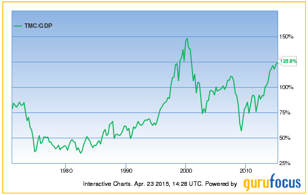
Let’s examine where this indicator currently sits going back to the 1970s (chart courtesy of GuruFocus):

There’s two key takeaways when examining the chart above; first and foremost, we can see this indicator has in fact proven its predictive powers over the last two downturns on Wall Street. Notice how this ratio peaked above the 100% mark, meaning that the value of the stock market exceeded that of the underlying economy, prior to the dot-com and housing bubbles bursting in early 2000s and 2008 respectively.
Second, this valuation indicator is not meant to serve as a hard “buy” or “sell” signal like some technical indicators used by traders. Instead, it’s meant to put the current valuation of the entire U.S. stock market in perspective, by comparing it to the size and the economy. This means that the ratio is always evolving, seeing as how it’s comprised of factors that are constantly changing, and there are no clear-cut rules for determining when it is screaming that we’re “at the top” or “at the bottom” with regards to the performance of major equity indexes.
All in all, the market cap to GDP ratio can be helpful in providing long-term minded investors with an idea if whether or not we are approaching “bubble territory” based on how markets have behaved in the past whenever this metric has reached certain levels.
The Bottom Line
Currently, Buffett’s favorite valuation indicator is suggesting we are in “bubble territory” and we might even be approaching levels that in the past have coincided with peaks in the stock market. However, remember that history rarely repeats itself word for word, but it does rhyme; meaning that, we can remain in “bubble territory” for quite some time so there’s no reason to panic and sell everything, but keep in mind that bargains are getting harder and harder to come by in today’s environment.
Be sure to follow us on Twitter @Dividenddotcom


